Instagram filters have really changed the way the average Joe/Jane with a smart phone think about their photos, they now realize that they can add mood to their photos by selecting a filter such as "Ludwig", "Crema" or my favorite "Kelvin" to name a few, Kelvin is one of my faves because for us science nerds we know its a form of measuring absolute temperatures developed by Lord Kelvin in the 1800's he studied the thermodynamic effects of heat which is why the Instagam filter has oranges and reds in it, other filters like "X-Pro II" is an old film developing technique called "Cross Processing" which is when you would process film in a solution developed for another film type so it has that look to it, I could go on for a while so I'll just cut it short here, the point Im trying to make is that they are just a predefined group of colour and even contrast settings. Some may think they are doing something new and interesting but the fact is the photographic community has been doing this since photography was invented, even back in the black and white days before colour images photographic paper would be stained with tea to give the image a sepia look, later when colour became available they started playing around with boosting some colours and desaturating others to achieve a desired affect, the film or movie industry uses this extremely well, so well that we now instinctively understand the difference between TV and Film purely by the look and feel, this is also know as the "Filmic or Cinematic Look". Now predefined filters are good and well but they dont really allow you much control, your kinda stuck to the settings you can adjust hues and contrast but not individual colours or luminance setting etc. So how can we go about achieving this without Instagram filters. Below I'll have a look at a few popular effects and study how I managed to achieve them in Photoshop, this can also be done in Lightroom and GIMP.
Colour Wheel
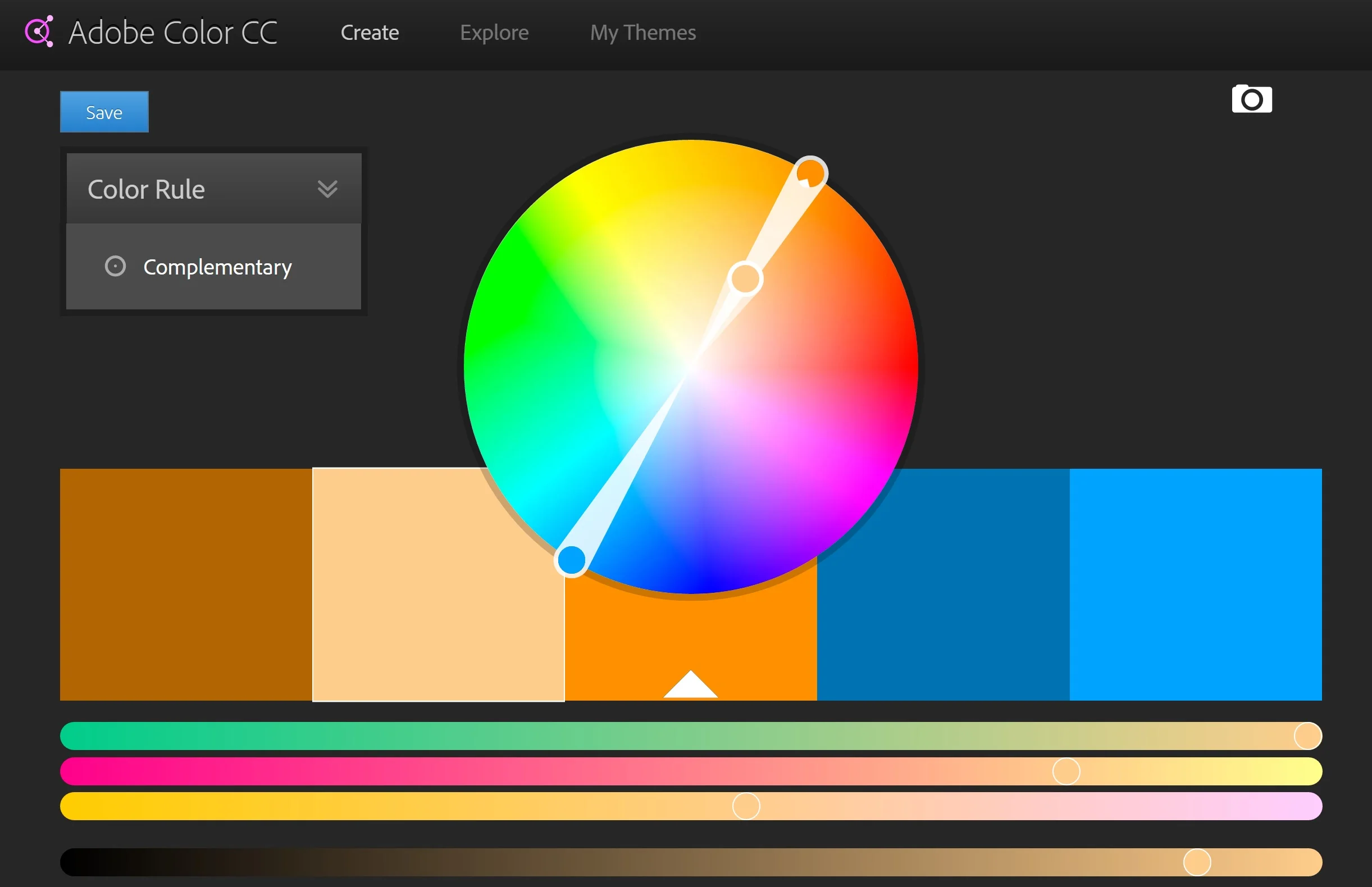
First we need to look at the colour wheel and understand complimentary colours, as the name suggests these are colours that compliment each others and basically they can be found on opposite sides of the wheel, as you can see in this image.
Cinematic or Filmic look
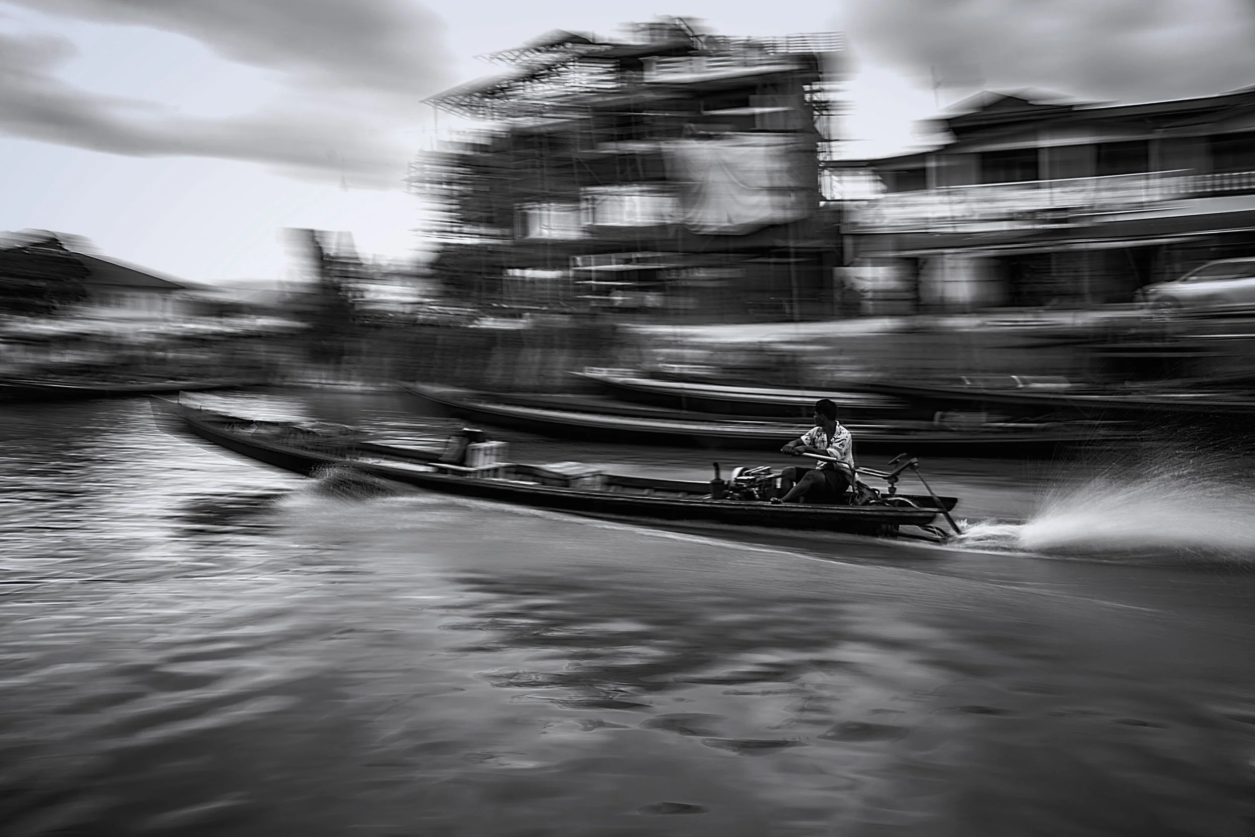
This look and feel is what we associate with movies, basically the mid-tones and dark's are pushed into the Blues, Teals and Green and light tones pushed into the Yellows, Orange and Reds this is because these colours compliment each other. Skin which is a tanish yellow orange depending on the tone would be complimented by Teals and Blues [see colour wheel image] it would also fall into the light areas this helps make it pop out more against the back ground which is what you want.
Below are three images of me smokin a cigar with a beard in a place called Inle Lake Burma, great cigar very smooth flavour, anyway so the first image has basic white balance and no colour correction, the middle had blues and green added in mid tones and darks as well Ive increased the Reds and added a little contrast, thirdly Ive added a black bar top and bottom to change the aspect ratio to "letter box" comonly used by Hollowood and it appears to be a screenshot from a Hollywood blockbuster right? am I right?.. anyone?? OK so my ugly mug dosnt quite fit the bill but come on man!

!. Basic white balance

2. Cinematic colour correction

3. Cinema aspect ratio
Here I am smokin a cigar with a beard in Viñales Cuba, Im inside a barn and the cigar had just been rolled at the farm where the tobacco was grown, it was also very smooth and they also add a little honey on the end you put in your mouth to give it some extra flavour. Now the background has more reds than blues or greens so the effect is not as obvious, but thats the intention, Im not trying to distract the viewer by messing with the colours too much. The one above is harsher and colder.

1. Basic white balance

2. Cinematic colour correction

3. Cinematic aspect ratio
Thirdly here Im not smokin but still sporting a beard, at first glance it may seem I'm in an office the truth is its a selfie I took using the natural light coming from my bathroom window, Id just bought the suit and thought Id take a couple shots for the archives. Anyway, so here Ive boosted the greens to give a look similar to the one used in the Martix trilogy, the Wachowskis figured that most people associate green with being inside a computer so whenever Neo is in the matrix a green tone was used, they then switched to a standard tone when back in reality.

1. Basic white balance

2. Cinematic (Matrix) colour correction

3. Cine aspect ratio (inside Matrix)

3. Cine aspect ratio (Outside Matrix)
So as you can see colour tone can be used to give mood and effect to an image, now I didnt go into the exact steps becuase in PS, LR and GIMP they vary, but basically:
Photoshop and GIMP
In PS and GIMP you need to create a curves layer then play around with the RGB channels.
1. Create curves adjustment layer and select a Channel start with Green and Blues.
2. Drag the e.g Blue channel from the bottom left up this will affect the Blue pixels that are in the dark areas, drag the channel from the top right to the left as well.
3. do the same for Red however here you need to pin it from the middle [see images]
4. Boost contrast as you like.

Photoshop Curve

GIMP Curves

Lightroom Split Toning and Contrast adjustment
Lightroom
In Lightroom you'll need to use the Split Toning panel to bottom right of this screen cap, you'll also need to play with the contrast, lightroom is not as precise as PS which is why my preference is always to go straight into PS.
So thats the Cinematic look, now lets have a look at another fave of mine Urban Grundge.

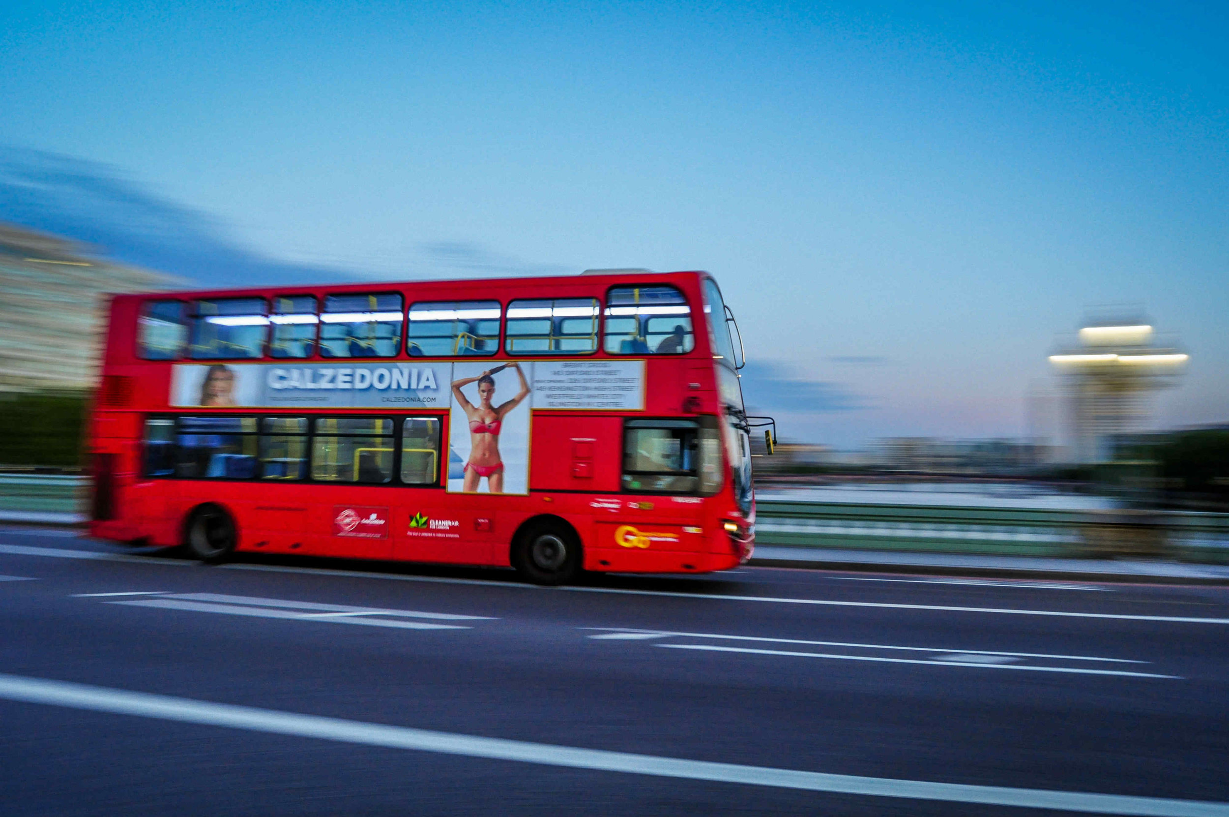
Cuban School Bus
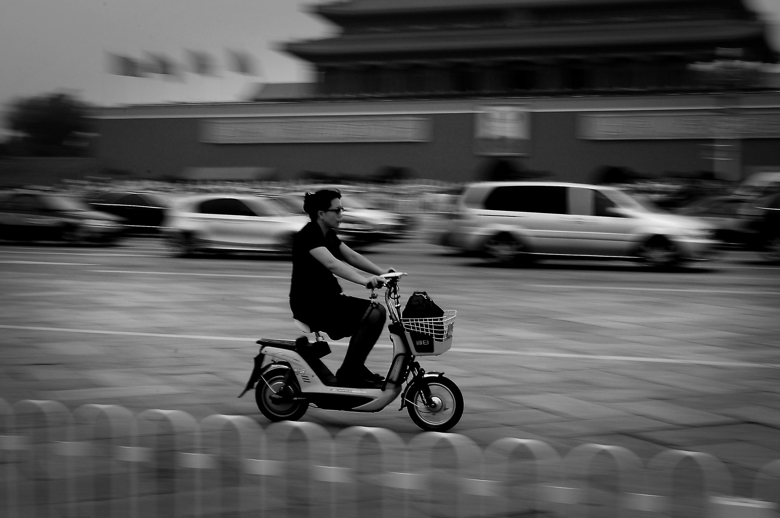
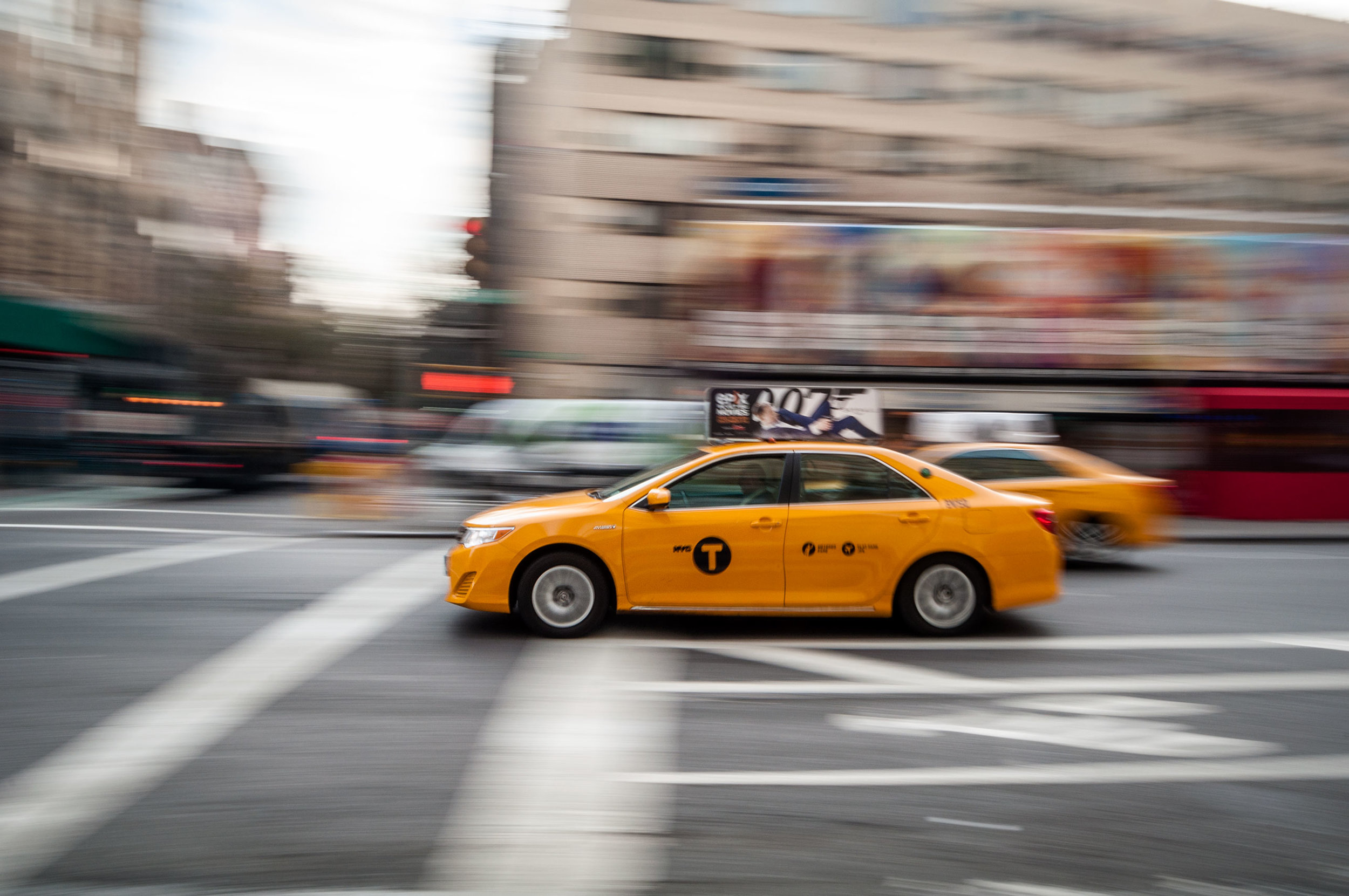
Urban Grunge
This look can be achieved by simply increasing contrast and boosting certain colours, which colours depends on what you equate with urban and grunge e.g when I think of these words I think of yellow street signs and lines, orange bricks and grey roads. By emphasizing these colours and de-saturating others such as magenta, cyan's, purples, etc the image will begin to feel urban, then symply boot contrast to give it a more grungy look and voilà!

Mosque-Cathedral of Córdoba

NYC Avenue

Sydney Opera House
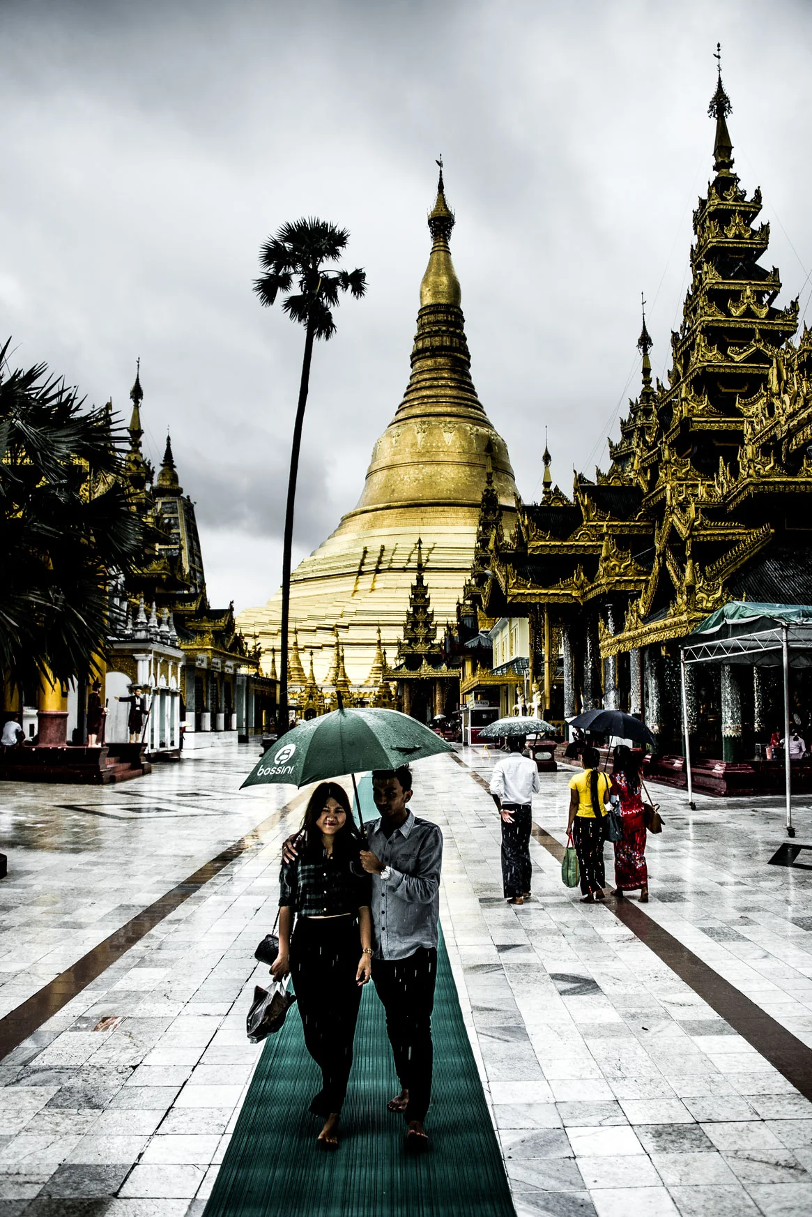
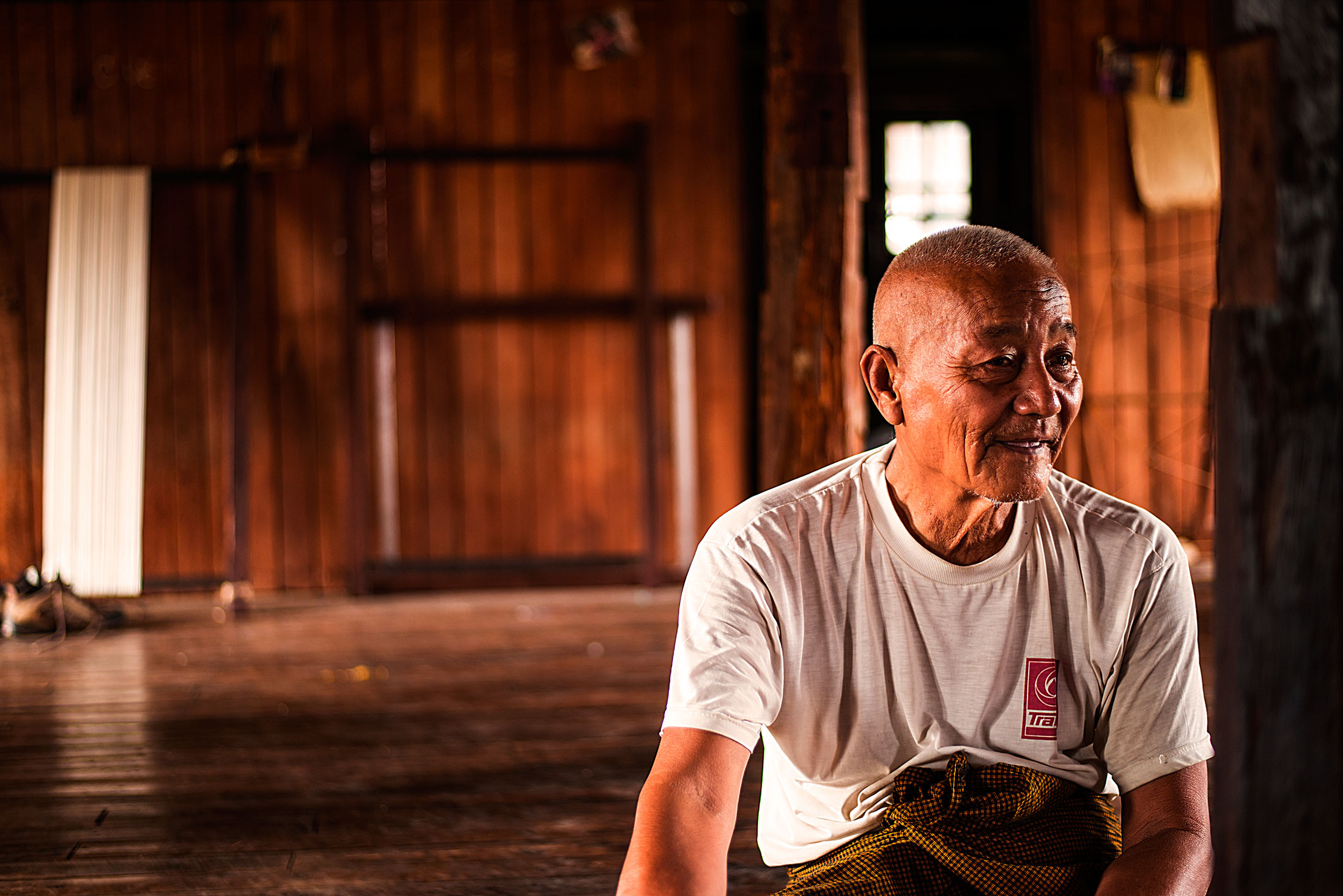
Shwedagon Pagoda, Yangon Burma

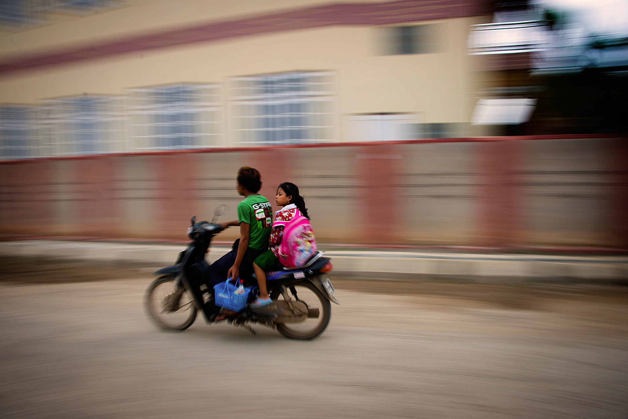
Cuban motorcyclist

Plaza de España, Sevilla Spain
Now these filters can be added to taste and it really comes down to the look and feel you want to achieve, also there are many others such as the desaturated soft pastel look thats become popular.
Soft Pastel

Boat at Juan Lopez beach Anotofogata, Chile
Again just playing around with settings such as:
Basics Panel: boosting the Contrast, Highlights, Shadows and blacks, then reducing Clarity, Vibrancy and Saturation
Split Toning Panel: In Highlights set the Hue to an Orangish and saturation to around 40, then Shadows make them Blueish and Saturation around 60
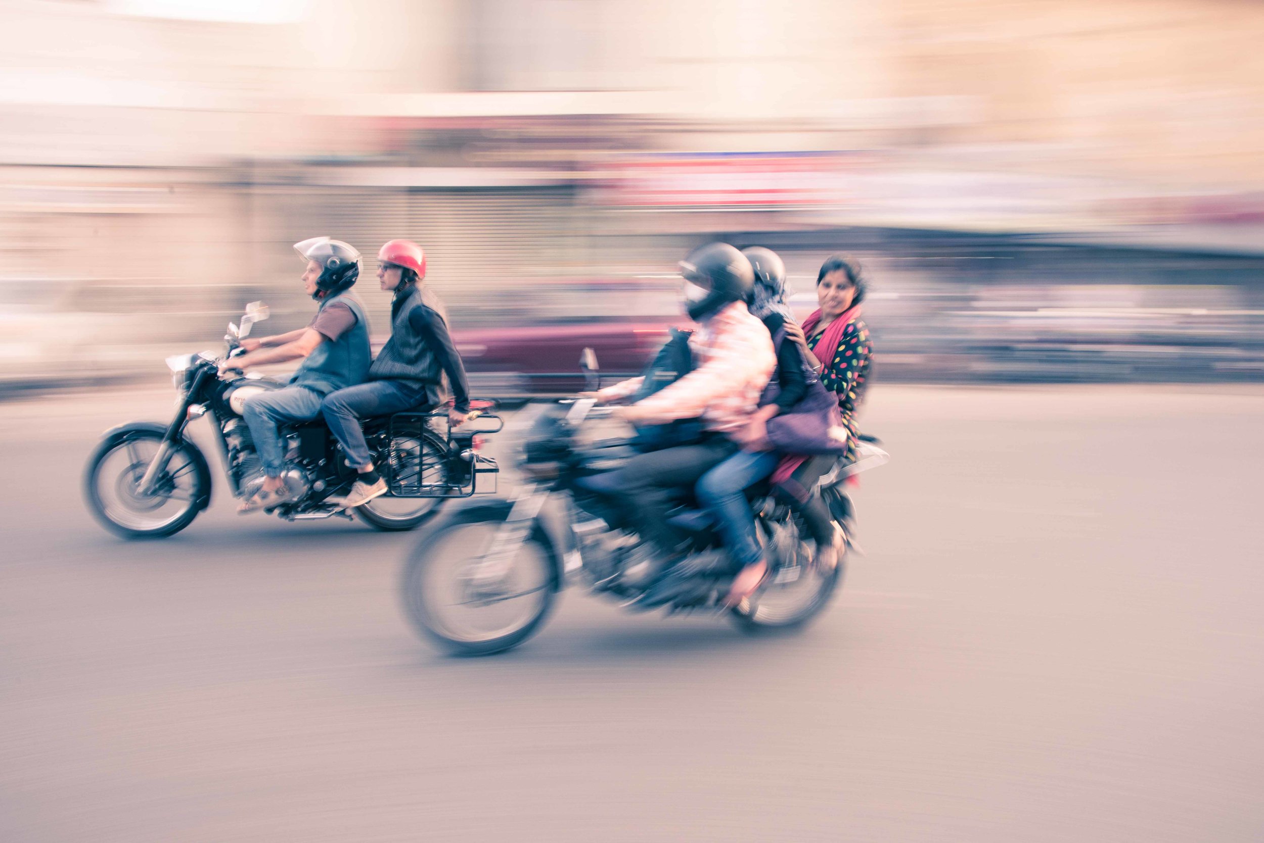
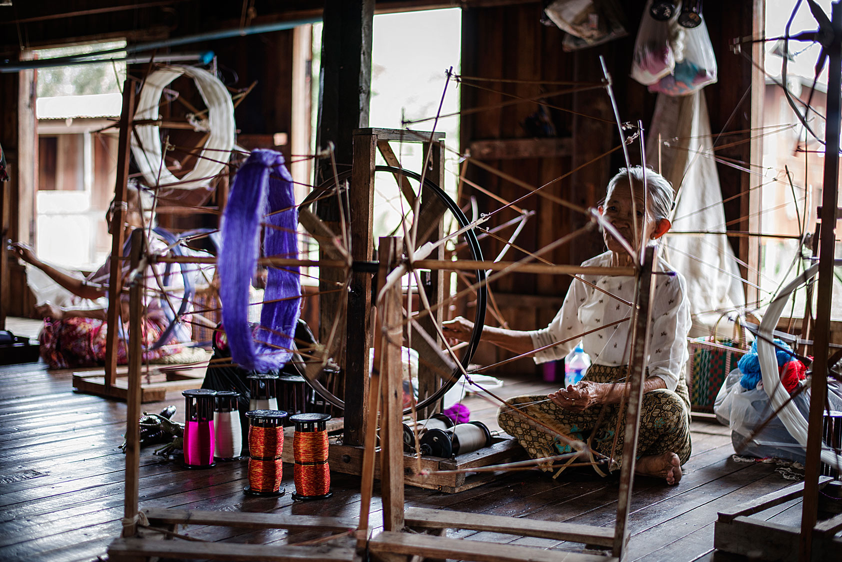
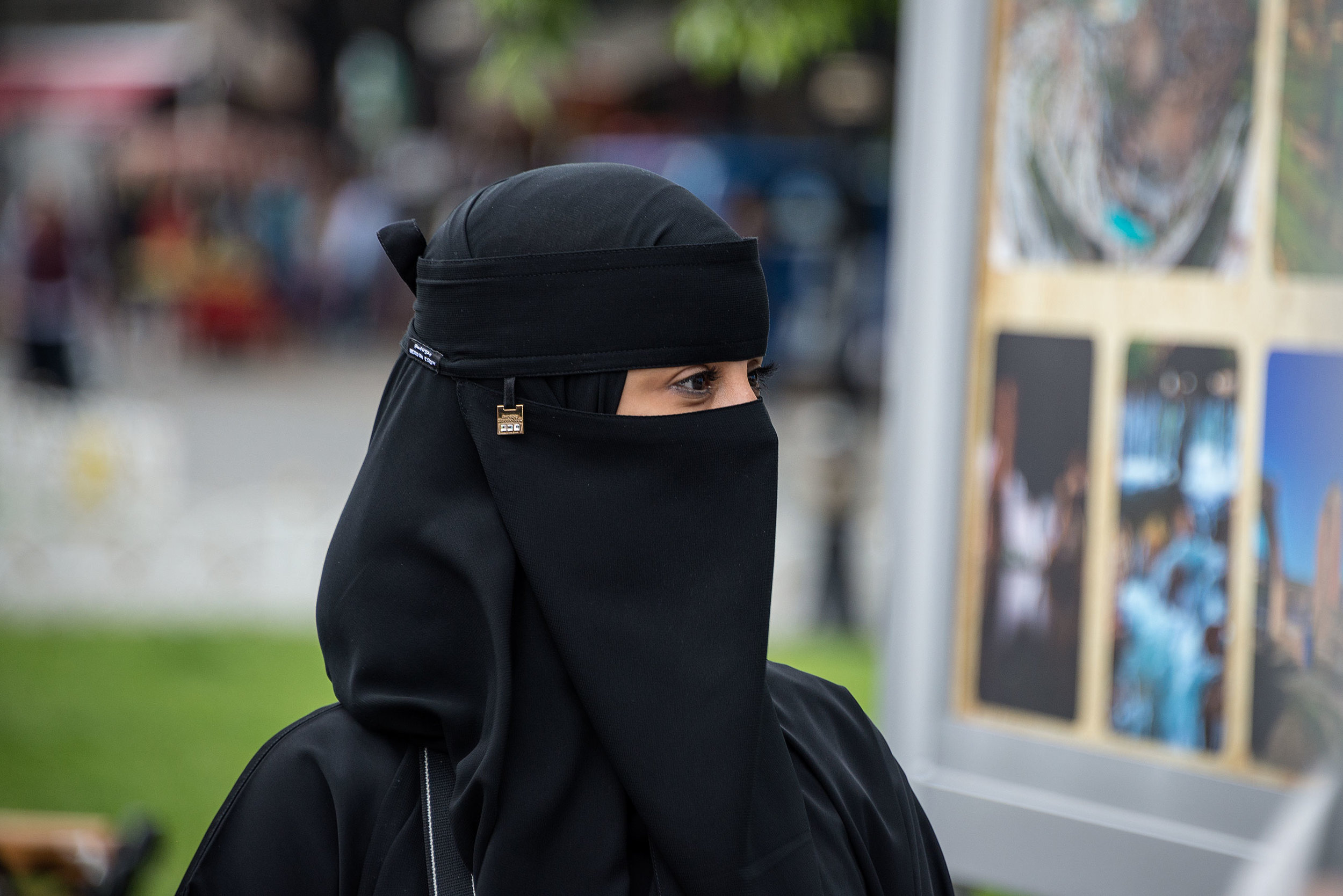
India

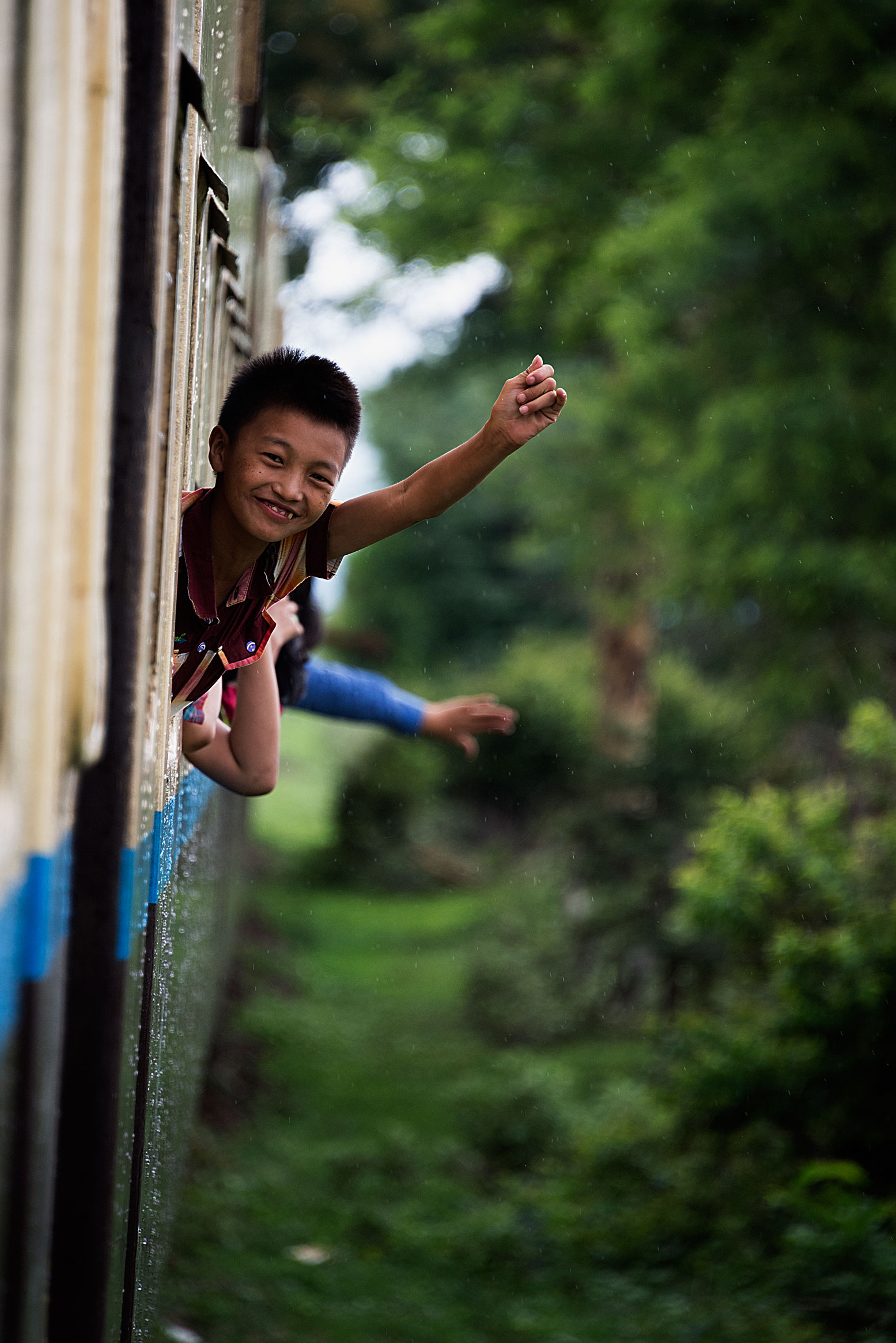
Burma

Pepsi Bottle India

Jeep in India

You guessed it!
Ok so I think thats enogh for this Blog, BYE!!